
850°
Logo and identity for a hero sandwich and New York pizza spot in Oberkampf, Paris.
The project
William and Hugo already had the name, 850°. It needed a face: a logo able to carry New York street culture, for a spot serving hero sandwiches, still new to the French market.
The approach
The logo was designed bold, almost massive, with a used, washed-out finish. It had to feel as if it had always been there, like a weathered sign on a New York street.
The logo
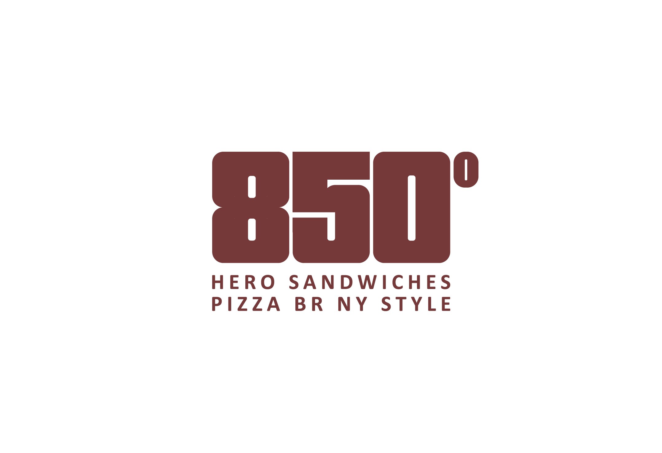
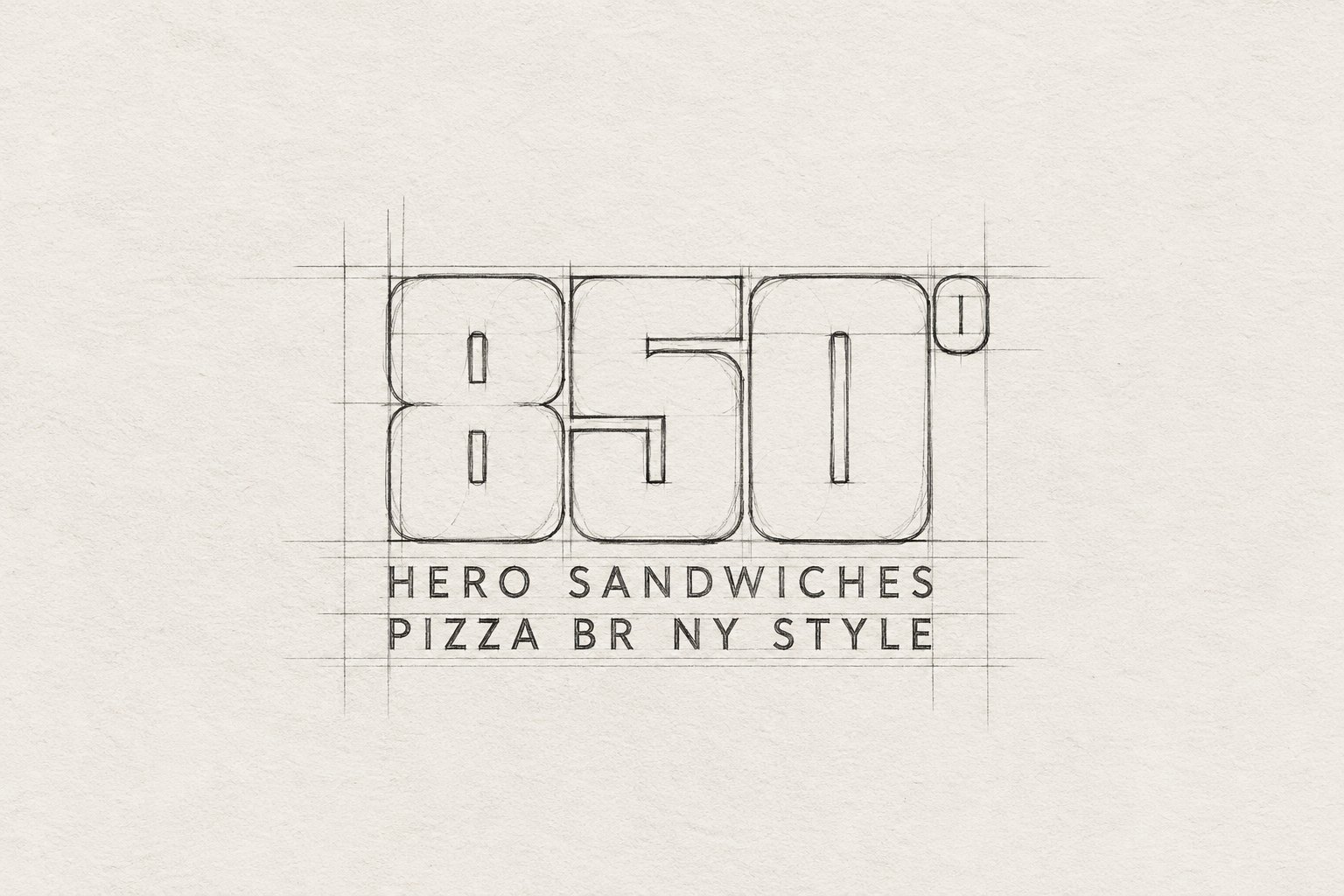
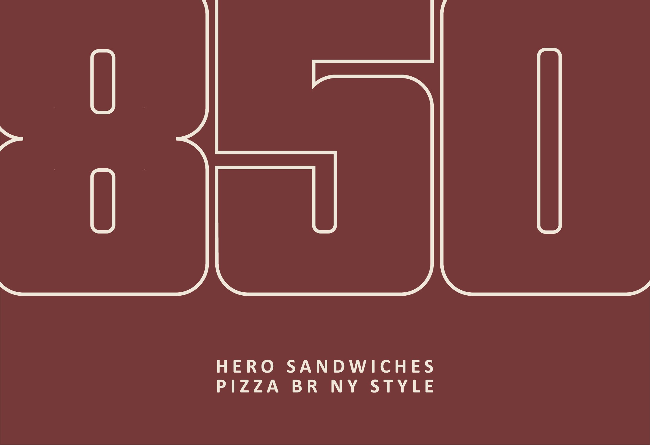
The sketch sets a simple grid: three heavy numerals with rounded corners, a superscript degree and two lines of spaced capitals, “Hero sandwiches” and “Pizza BR NY style”. Solid burgundy on a light ground or cream outline on burgundy, the logo keeps the same presence.
The sign
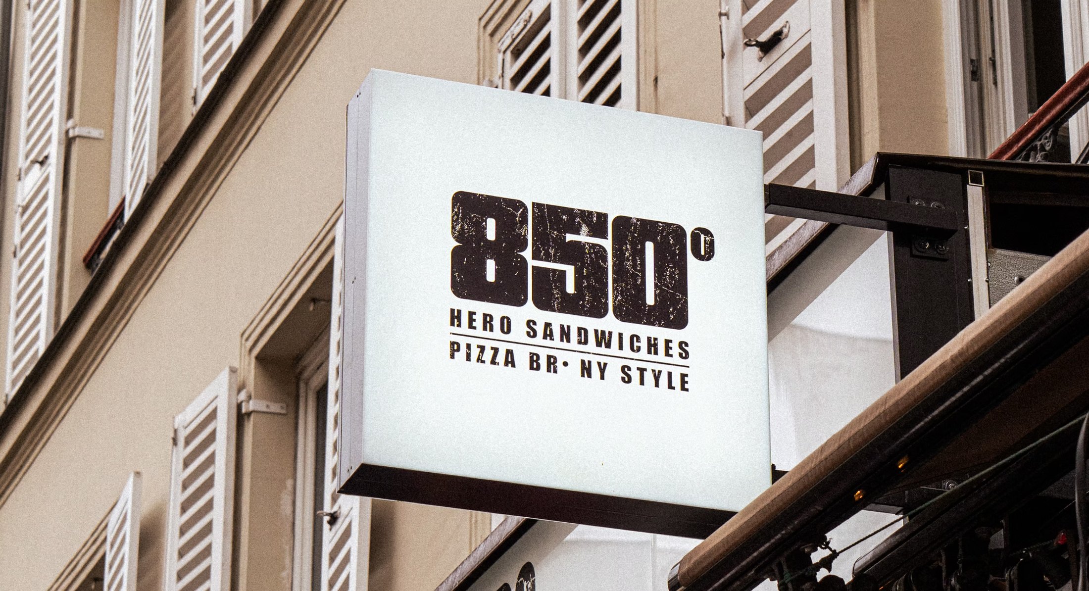
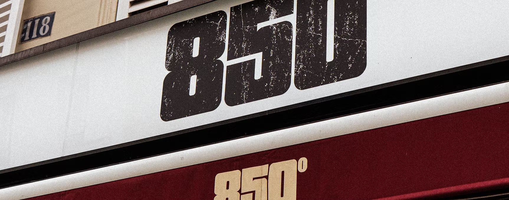
On the shopfront, the logo is printed with its worn texture: black on the fascia, cream on the burgundy awning. The projecting sign carries the full version with both lines.
The hero
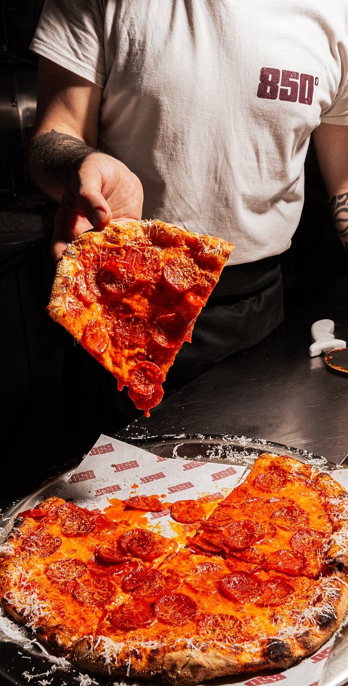
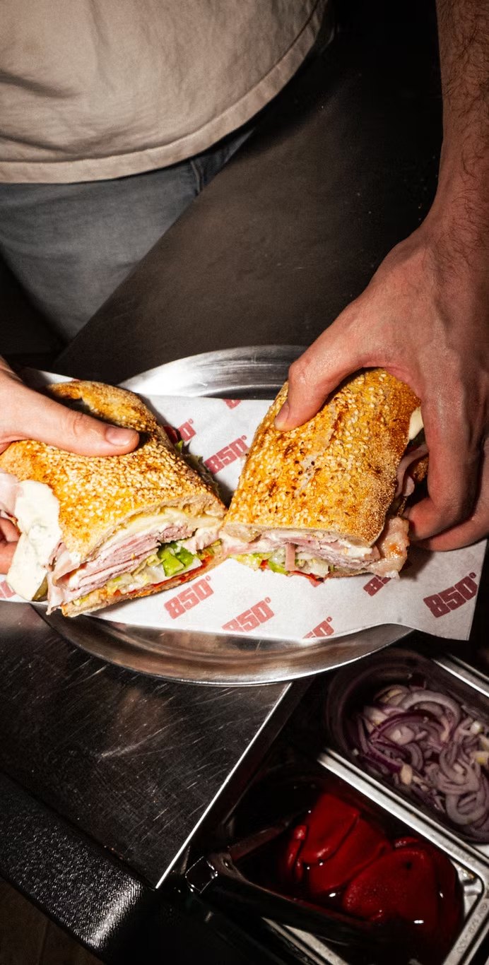
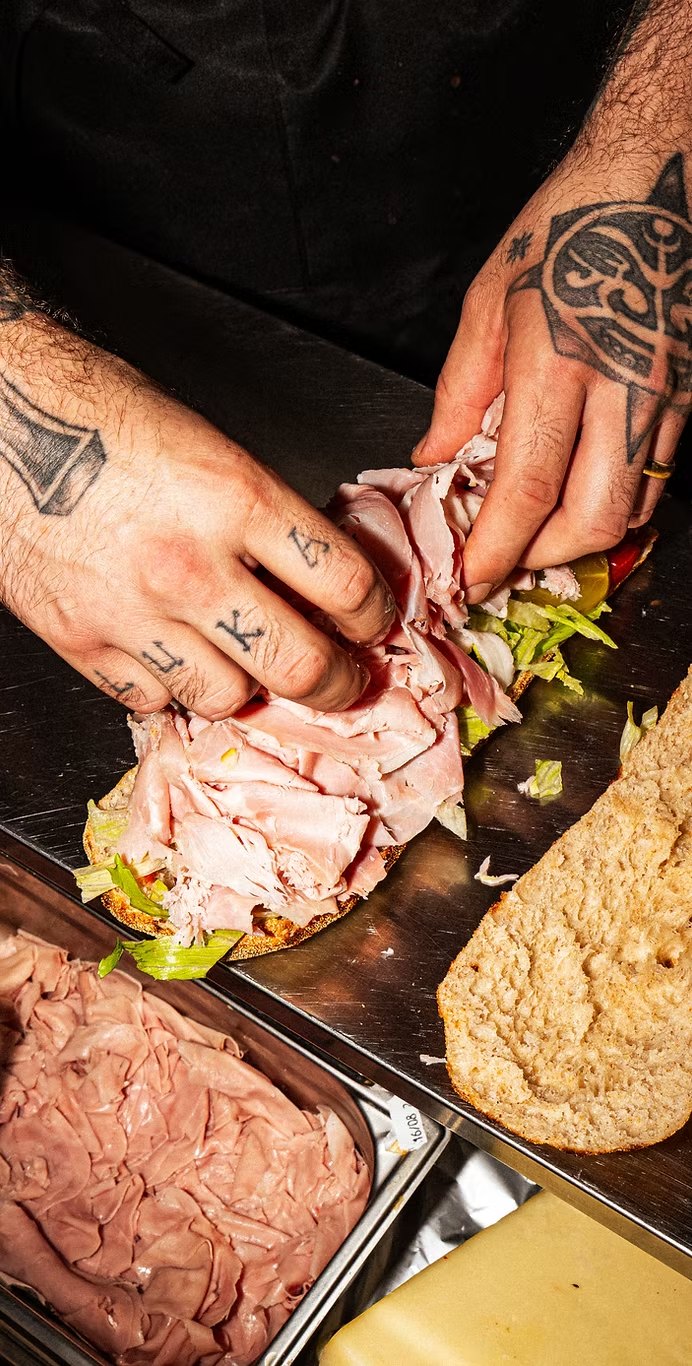
The hero sandwich, a New York deli classic, arrives in Oberkampf alongside pizza by the slice. The logo follows all the way to the counter, on the team’s t-shirts and the paper on every tray.
About the project
The logo was designed by Jon Filin, alongside William and Hugo, the founders of 850°, who had already chosen the name.
In Oberkampf, in the 11th arrondissement of Paris.
A large New York sandwich on a long roll, filled with cured meats, cheese and vegetables. It is still rare on the French market.
To evoke New York street culture: a bold, weathered logo that seems to have always been part of the street.
One vision, from story to place.
Discover the approach →